Halo on Framer
Improving the Halo web presence by reducing internal friction.
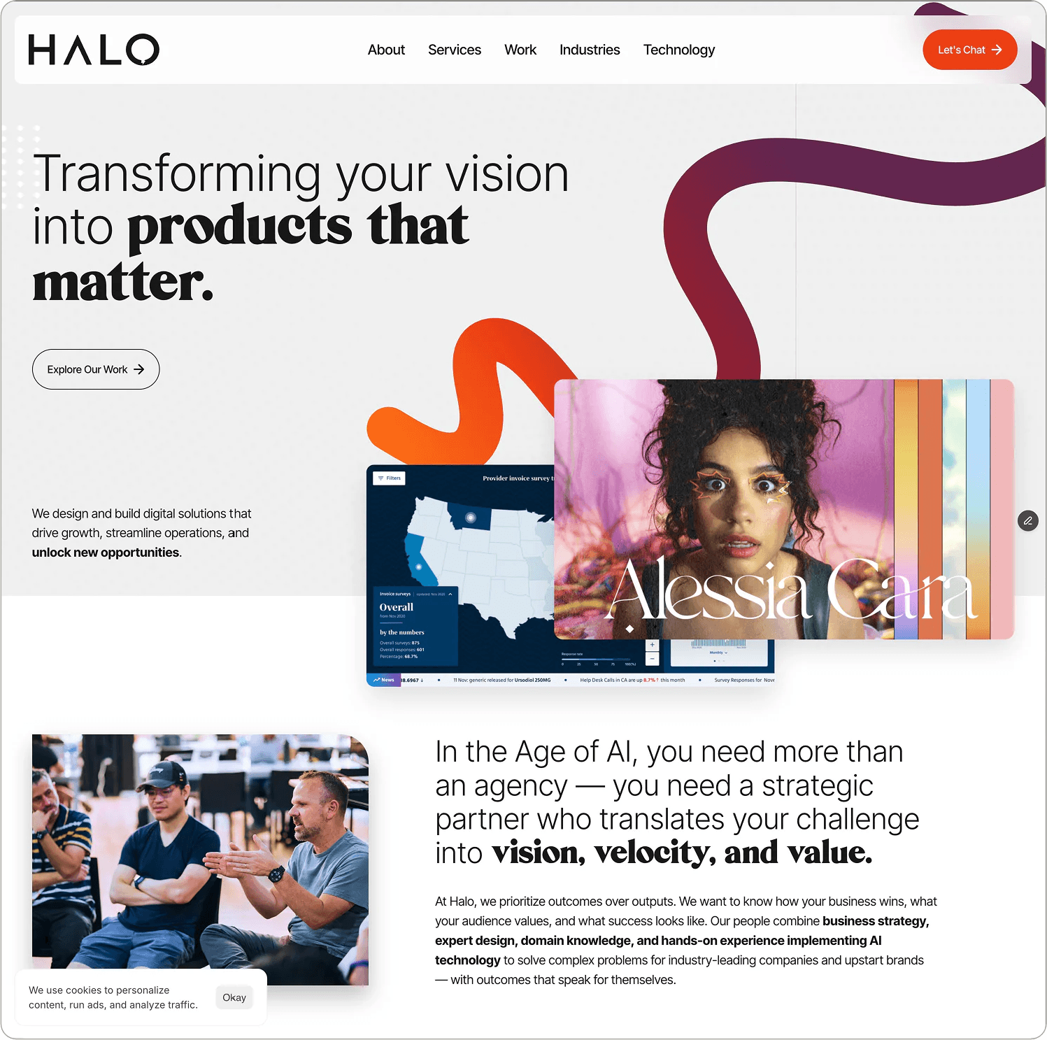
Halo did most of its business through existing clients and word of mouth, and for years it had very little need for an online marketing presence. Until it did. And because an agency always wants to show its best, building its own website was always tangled up in asset sharing, scheduling, and the simple fact that putting top design or development talent on the company site meant pulling them off paying work. That's when I recommended Framer.
- Role
- Design Lead, build, platform champion
- Timeline
- ~2 months of part time
- Stack
- Framer (enterprise), Rive, custom code overrides, and components, Glyphs 3, Figma for Approved Design
- Team
- Two designers, part-time — direct partnership with Framer
- Outcome
- Shipped. Complete, live, Keys for content handed to marketing team
Where this started
Halo, like a lot of agencies, had a marketing site that had been waiting in line behind client work for years. I'd taken to calling it the cobbler's flipflop.
The site had been queued up for a refresh, on and off, for the better part of a decade, and every time, client work cut in line. That's the right call, for what it's worth. Client work pays, and most agencies protect their margin by pouring everything into it. By the time I got involved, the site had been a single-page placeholder for a while, and another design cycle was already forming behind it. The only real question was whether this would be the round that actually shipped.
Making the case
I'd been pitching Framer and Webflow as production platforms inside the agency for a while. The argument was simple enough: designers build what they designed, the shipped result actually looks like the approved comp, and delivery costs less. It just hadn't found a project to stick to. After one of those pitches didn't go my way on a client project, I asked the leader who'd made the call for a second conversation, and walked through all of it, the research, the partner outreach, and the margin math.
I was expecting a polite "maybe next time." What I got instead was "why don't we try it on our own site?" Learn the platform internally, where the only stakes were ours, before offering it to anyone else. Honestly, it was a better idea than mine. An unfamiliar stack on a client engagement is a risk. The same stack on your own site is R&D.
The team, and a free license
I put out a call for designers who wanted to learn Framer, and a small group volunteered, people curious about owning more of the build instead of handing off comps. I also opened a line with Framer's partnerships team and came away with an enterprise license the agency could use without limit.
That license mattered more than it sounds. Once internal cost was off the table, nobody could use it as a reason to quietly shelve the experiment, and we got to work as a real production team instead of a side project.
The build
The design was ambitious. Custom microinteractions, layered animation, and typography fussed over down to the pixel. It was enough that the engineering scope had been a real concern for the bandwidth available. We built it as designed, without simplifying anything, using Framer's component model, code overrides where the platform came up short, and Rive for the animated centerpieces.
When I say "we," I mostly mean Linna Liu and me. A year earlier I'd argued to bring Linna onto the design team from an unconventional path inside the agency, at a time when the preference was to hire experienced designers only. She came to design from a technical background, which made her an obvious fit for Framer. She had a designer's instincts and no fear of bending software until it did what we needed, and this project asked for that at every layer. Between the two of us, part time, it took about two months.
The worms
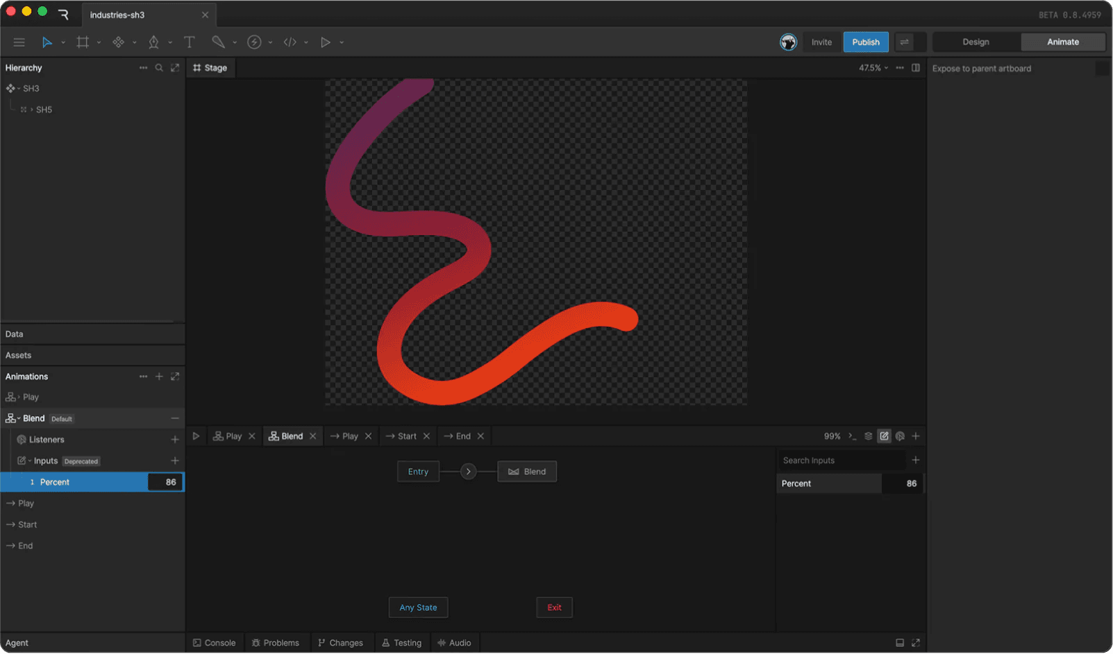
The design team called them worms: long, organic, painted ribbons that draw on and off the screen as you scroll. We tried a few ways to build them, including Framer's then-new vector animation tools, and landed on Rive. The catch was that the stock Rive import plugin didn't expose Inputs, and Inputs were exactly how we needed to pipe scroll progress into the artboard.
So I wrote the import component myself, in ChatGPT. Copy, paste, revise, copy, paste, revise. It was my first vibe-coded production code on a live site, and I checked on it more often than I'd care to admit. The finished component exposes a Percent input that blends between the start and end states of the artboard's state machine. Scroll position becomes a percentage, the percentage drives the blend, and the worm paints itself on or off as the page moves.
Rive has since deprecated that Inputs API in favor of Data Binding. The component held up through launch, which is all I asked of it.
The typography rabbit hole
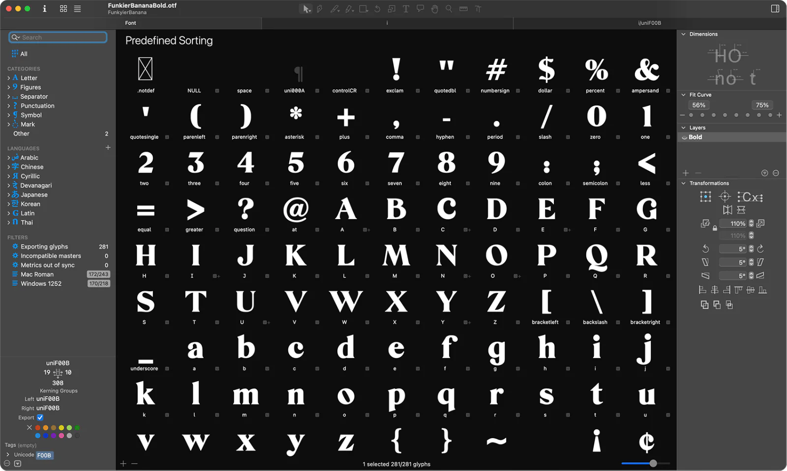
The headlines paired Inter with a display face the design team had been setting by hand in Figma. That works in Figma, where a designer is nudging every line. It doesn't work on a live site where a marketer needs to drop in a new headline without the pairing falling apart. The two faces had to agree on baseline, scale, and weight all by themselves.
So I bought Glyphs 3, out of pocket. In fairness, I'd been looking for an excuse to buy it for over a decade. I remapped baseline and scale across the whole glyph set so the display face would sit cleanly against Inter, then wired it in as the bold variant. The design team, watching over my shoulder, asked if I could swap the lowercase i and j for their first alternates. I did, by hand. Then I rebalanced the kerning on common letter pairs to suit how the production headlines actually fell on the page.
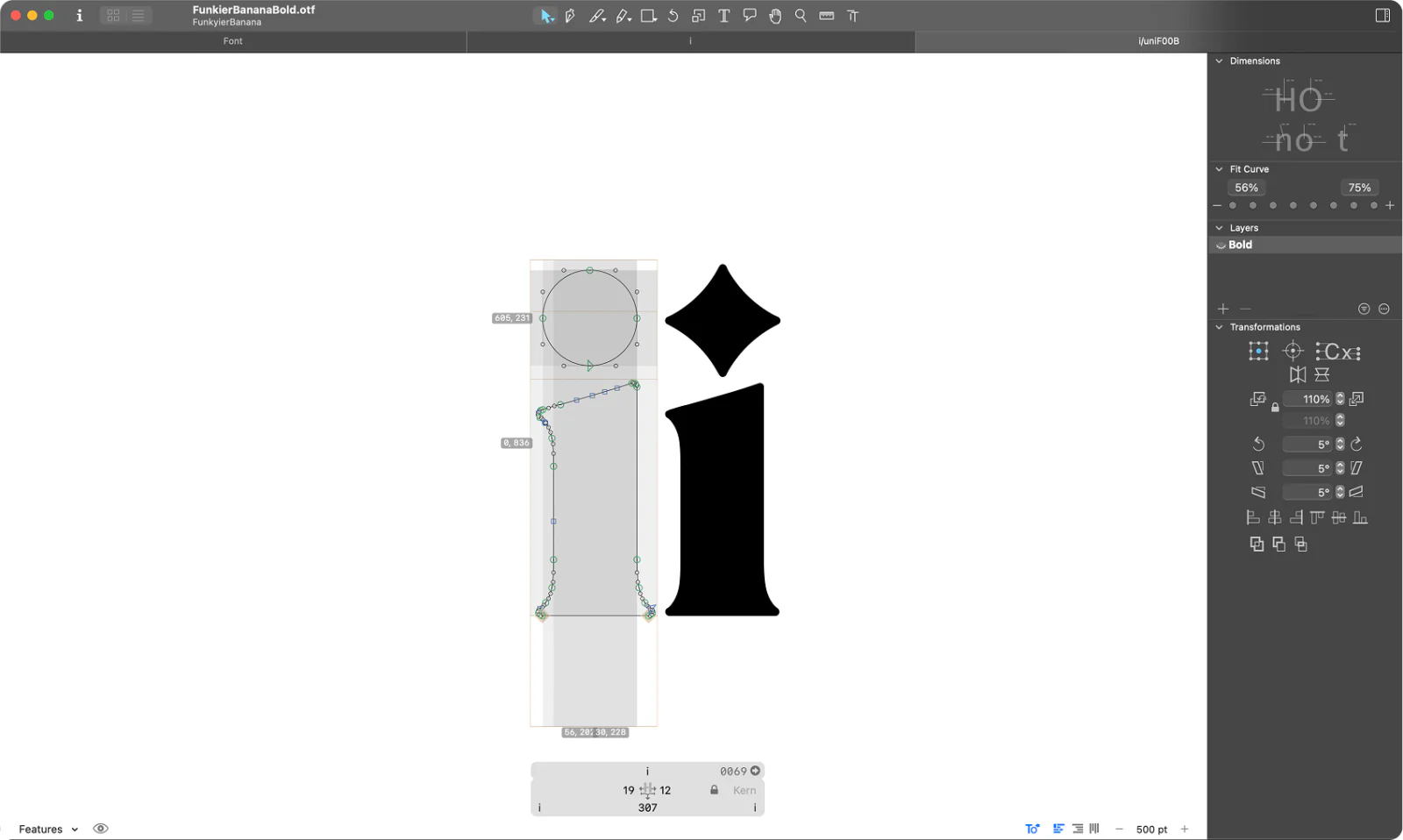
I fully expected the learning curve to kill me. It didn't, mostly because the typesetting I did early in my career finally paid me back. I love that software.
Outcome
Before we went live, we handed the keys to marketing and sales. Content editing, page composition, and new pages were theirs from day one, which was half the point of building it in Framer.
Then the site launched, with no paid push behind it and only whatever SEO it brought along by existing. The contact form went from effectively zero to a steady weekly drip of qualified inbound. Technically, that's an infinite increase. The real number is modest, and I won't pretend otherwise, but a site that had never brought in a lead now brings them in on its own.
What I took from it
I'd spent years arguing for design-led production platforms inside the agency, and the arguments never changed anyone's mind. The shipped site did. If there's a lesson in it, it's to stop arguing for the tool, go find the project where the experiment is welcome, and let the work make the case.
I've since moved on from Halo, but I'm told the team has shipped its first client site on Framer, for Chef's Table. Glad to see the path getting walked.