Silk River
A new information architecture and agentic UI for a high-pressure agency proposal.
Silk River came to Halo shopping for a design partner, and the pitch was supposed to be a bit of theater. A few rounds of comps, a good deck, may the best agency win. It turned into a win for Halo, and along the way I stumbled into an idea about how agentic products could draw their own interfaces, back before that was how everybody did it.
- Role
- Director of Product Design at Halo. IA, visual hierarchy, report design, and the agentic UI concept
- Stack
- Figma, Google Stitch, Claude Code, html-to-design, a DESIGN.md file, and a makeshift design system
- Team
- Me, an account lead from sales, and two designers on brand explorations
- Outcome
- Proposal won. Silk River chose Halo and moved to a full SOW and MSA.
The view from outside
Silk River is a fintech startup building AI-driven risk decisioning and financial-crime compliance tools. Its platform runs teams of AI agents over high-quality data sources and assembles deep risk reports. Loan officers use them to make fast, well-informed lending decisions, and compliance analysts use them to dig into suspicious activity.
The catch was that the door was closed the entire time. The NDA only came after our pitch was accepted, so I had no product access, no internal data, and no roadmap. All I had was the sales story Silk River shares with every prospective buyer. It honestly felt like guessing. So I guessed as big as I could go, and stretched that sales material as far as it would reach in the time I had.
Even from the outside, a couple of things were clear. The product underneath was strong, and the experience on top wasn't. The information architecture was flat, so every report carried the same weight and nothing told a reader where to look first. And the interface was a stock Tailwind-style kit that looked like every other enterprise dashboard.
Round one: hierarchy, and what's under it
The first brief was narrow: show improved visual hierarchy. You can't fix hierarchy by restyling a flat structure, though. That's sanding a board you haven't cut yet. So I rebuilt the information architecture around risk first.
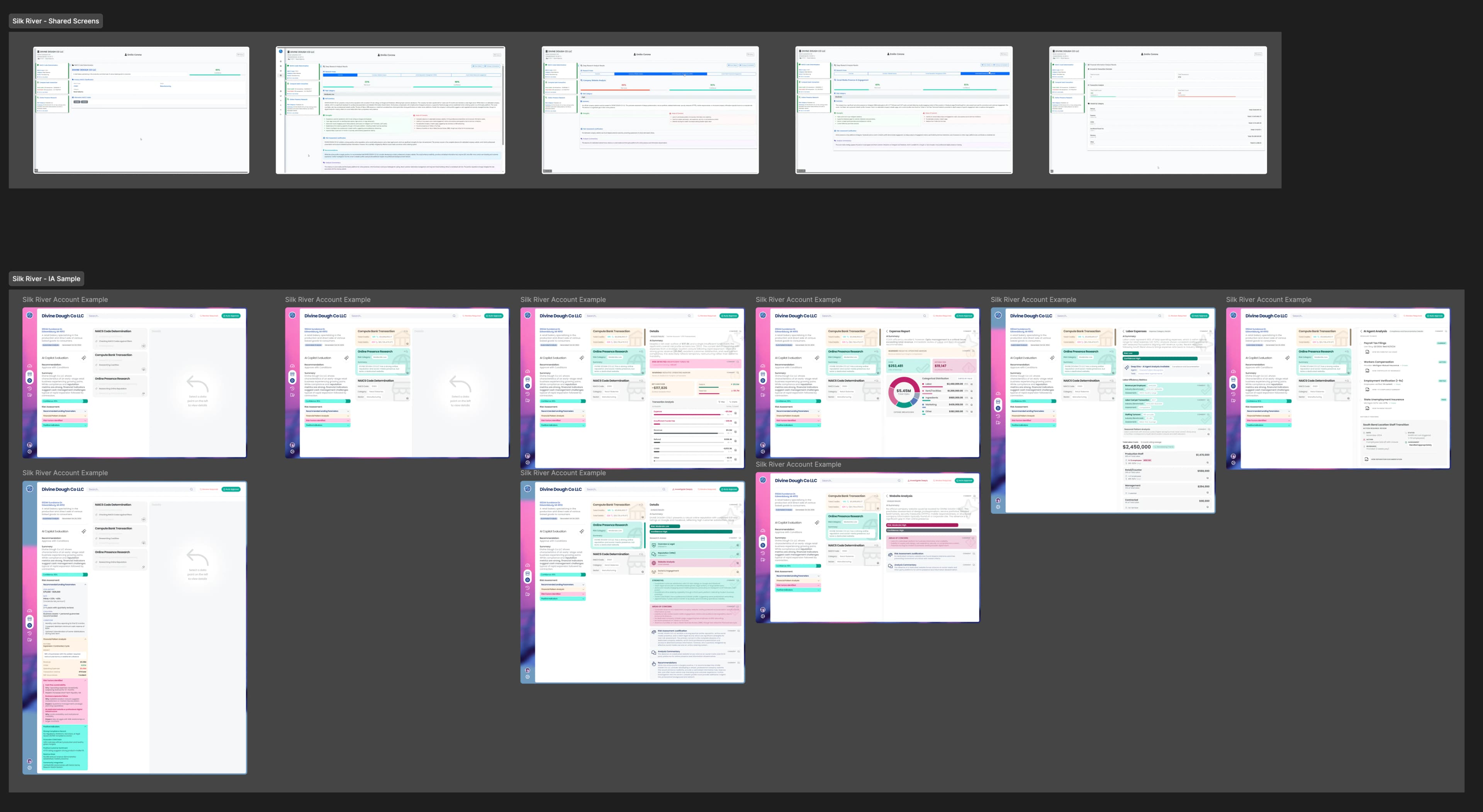
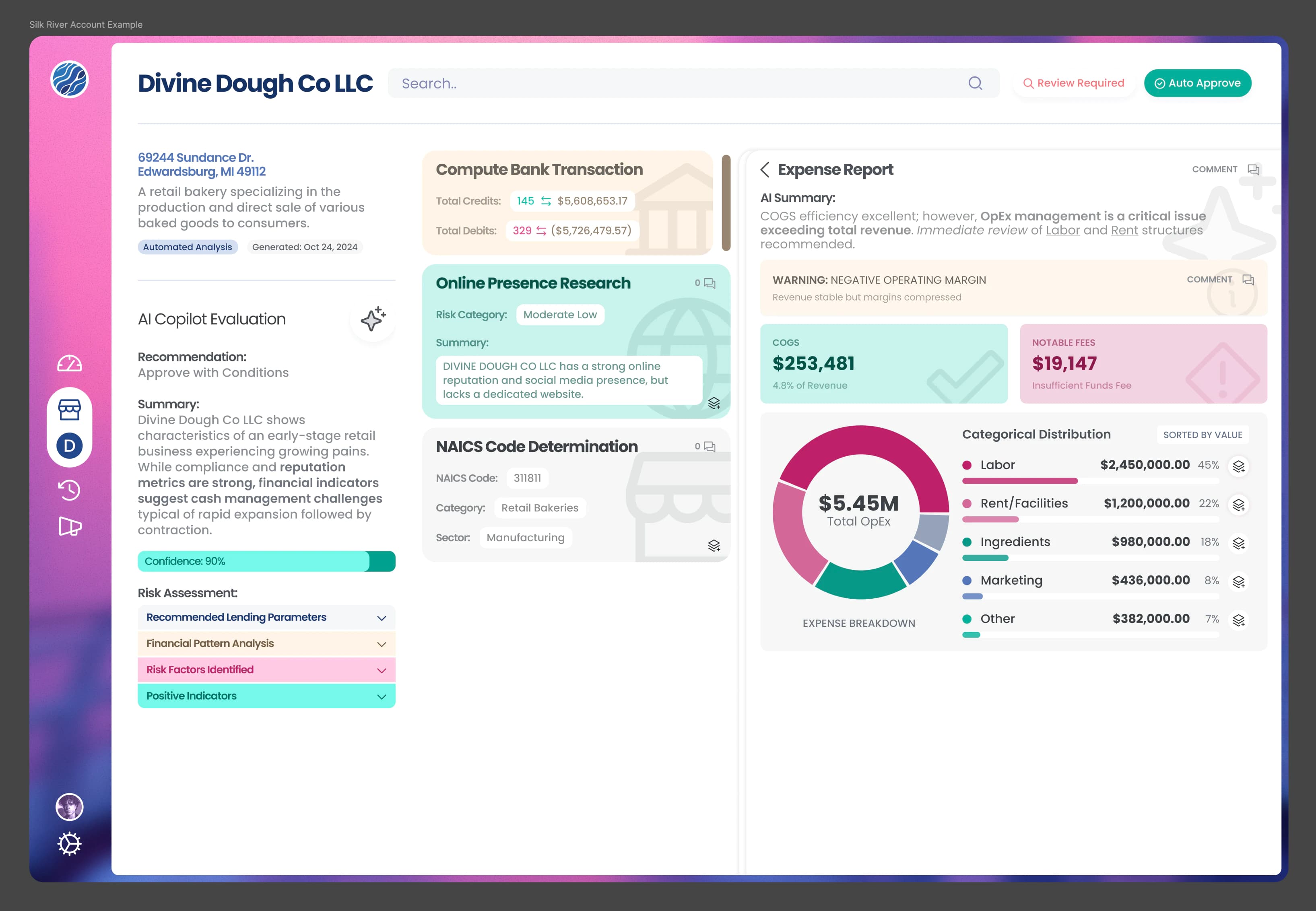
I treated each dimension of a report as a cluster of collaborating agents producing findings of varying depth. How many dimensions there are changes with each client's configuration, so the architecture had to flex rather than assume a fixed set of tabs.
On top of every dimension sat an AI Copilot Evaluation: one recommendation drawn from across all of them, a confidence score, and expandable sub-reports explaining how it got there. A loan officer gets the answer first and the evidence on demand.
The door was closed the entire time, so I guessed as big as I could go.
The central metaphor was depth. Layer icons replaced the usual chevrons as the invitation to open the next level down. Around that, I used color to signal risk level, put a confidence bar on every finding, set key phrases in bold so long agent narratives could be scanned in seconds, and added a comment layer for team review.
Every mockup followed a single sample business, a small Michigan bakery, so the room could watch one risk signal travel through every dimension and into the final recommendation. The benchmarks were the legacy names in the category, Sardine, Hummingbird, Oracle, and Salesforce, and the goal was to look and behave like none of them.
Round two: showing range
The second round asked a different question: how far can this agency go? I answered by pushing the visual design hard, with a new brand image and a product that looked nothing like enterprise risk software.
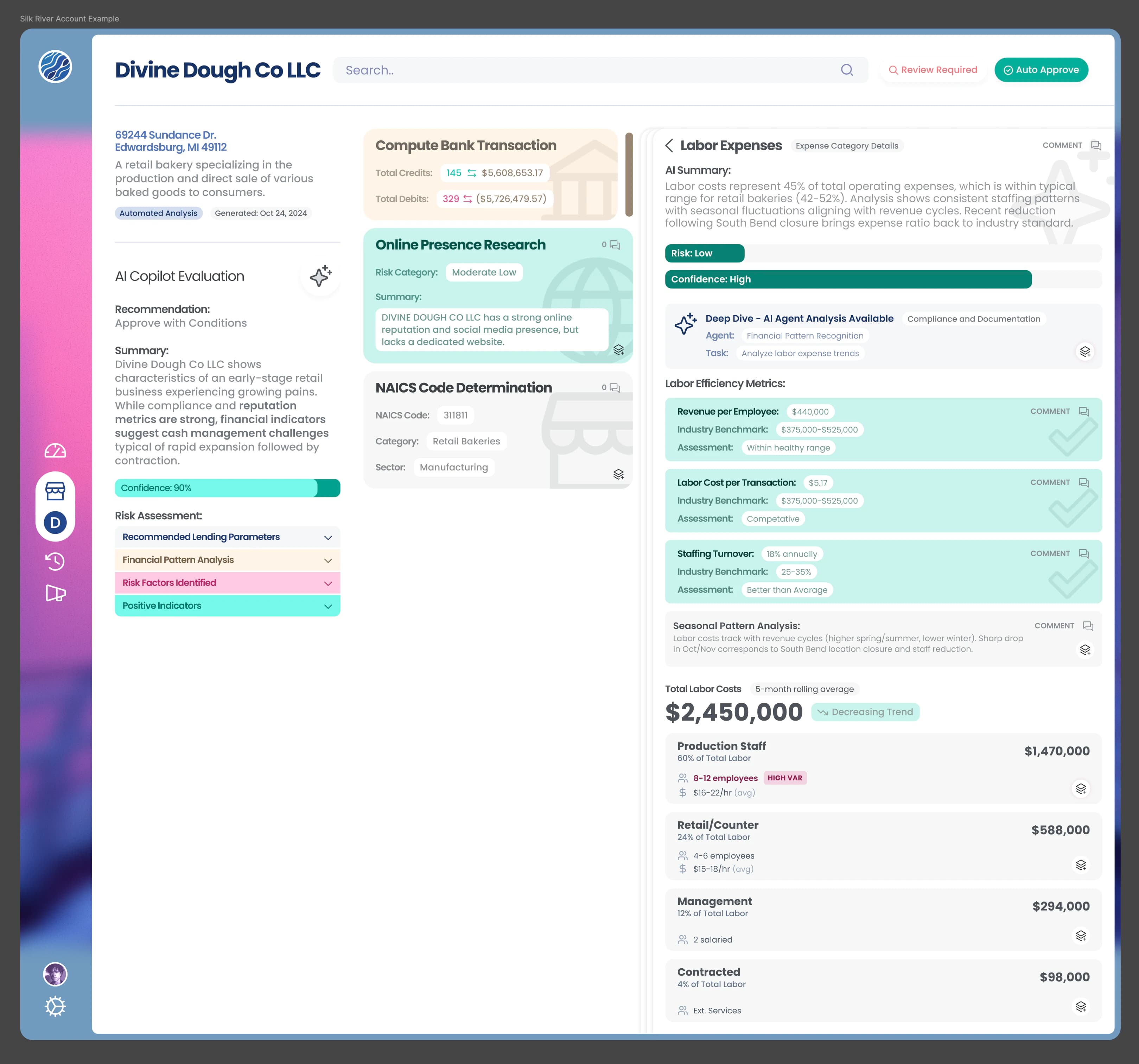
Two other designers took my architecture and built their own brand and layout interpretations of the main dashboard. Together, the three directions showed breadth on one shared structure.
The reports stayed with me. They were the deepest part of the product, and the method I was using to build them was too new, and honestly too hard to explain at the time, to hand off on that schedule.
A report in minutes
The schedule didn't leave room to hand-draw dozens of data-dense reports. So I built a production line out of AI tools and my own design judgment.
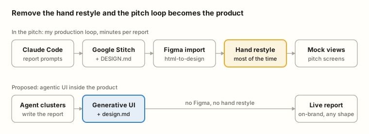
- Write the report. Claude Code turned real, public information about the sample business into a structured report prompt for each risk dimension.
- Visualize it. Google Stitch rendered each report as UI, with a DESIGN.md file keeping its layouts and components consistent from one generation to the next.
- Bring it into Figma. The html-to-design plugin converted each Stitch render into editable Figma layers.
- Restyle it. I restyled every report against a makeshift design system I'd built for the purpose, so it matched the new brand.
- Place it. The finished reports dropped into the mock product views.
Each report took minutes, and nearly all of those minutes went to the restyling. Everything before it was close to instant.
The idea hiding in the process
The method was holding the idea. If I could turn an agent's report into a consistent, on-brand interface by hand in a few minutes, the product could do it on its own. All it had to do was skip the part where I pushed pixels in Figma.
Silk River's agents already produced reports whose shape changed with every client and every case. A fixed library of screens would always be a step behind them. So instead, the agents write the report, a generative UI layer renders it on the spot, and a DESIGN.md file governs that layer the same way it governed Stitch, keeping every report on brand and structurally consistent.
I called it agentic UI and pitched it right alongside the designs. At the time, interfaces that render themselves weren't standard practice. Today they're close to the default in agentic products, and I'll admit it's nice to have been early.
The win
Silk River chose Halo and asked for a full SOW and MSA. From where I sat, four things won it. The sheer volume of work, far more than a pitch usually carries, right down to fully designed reports. The quality, which was good enough that the client recognized their own product without ever having shown it to us. The architecture, which made a complicated agent system readable. And the agentic UI idea, which showed where the product could go and not just how it could look.
That's where my part of the story ends, and it's the part I'm proud of.
What I took from it
The closed door turned out to be useful. With no product access, I had to reason about the architecture from first principles, and that reasoning is what produced it. The fastest way I could find to make the work ended up describing how the product itself should work, which is a good reminder that your process can be a prototype. And the idea landed because the room could see dozens of finished reports, not a diagram of some future system.
Guess big, then show your work.